MLB and MiLB
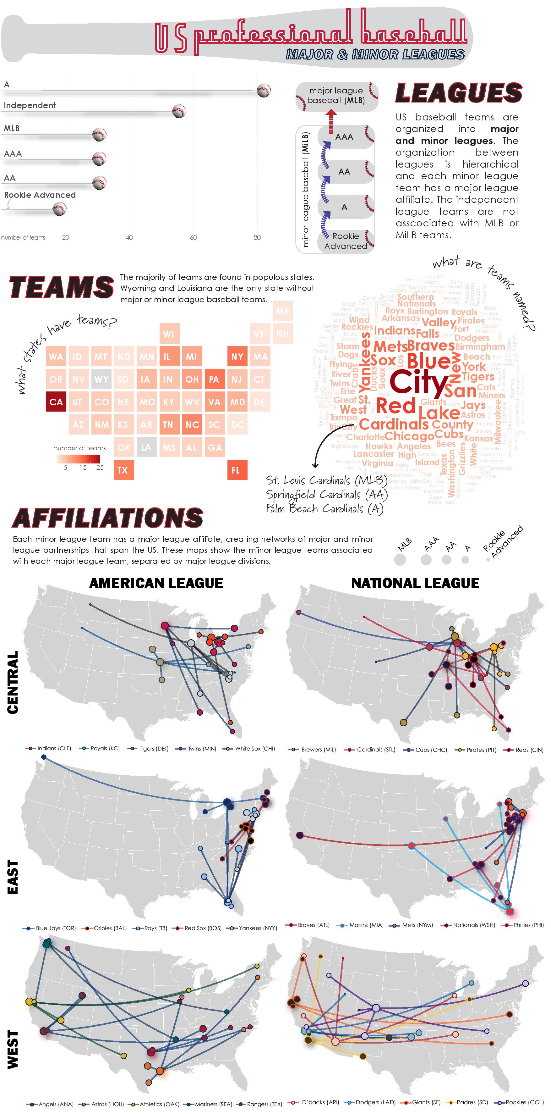 This infographic visualizes aspects of MLB and minor league (MiLB) baseball using data scraped from this user-created google map.
The upper left plot is a bar plot edited in Illustrator showing the number of teams in each league.
The middle row shows team characteristics: a cartogram created in the R package statebins to show the number of teams in each state and a wordcloud to show the most prevalent words in team names across leagues.
The maps at the bottom are a series of small multiples indicating the network of MLB and MiLB teams throughout the US. The size of the circles indicates leagues (largest size == MLB) and the colors are MLB team colors. Download here.
This infographic visualizes aspects of MLB and minor league (MiLB) baseball using data scraped from this user-created google map.
The upper left plot is a bar plot edited in Illustrator showing the number of teams in each league.
The middle row shows team characteristics: a cartogram created in the R package statebins to show the number of teams in each state and a wordcloud to show the most prevalent words in team names across leagues.
The maps at the bottom are a series of small multiples indicating the network of MLB and MiLB teams throughout the US. The size of the circles indicates leagues (largest size == MLB) and the colors are MLB team colors. Download here.
I also made an interactive R Shiny app here that uses the same dataset.