recent climate change
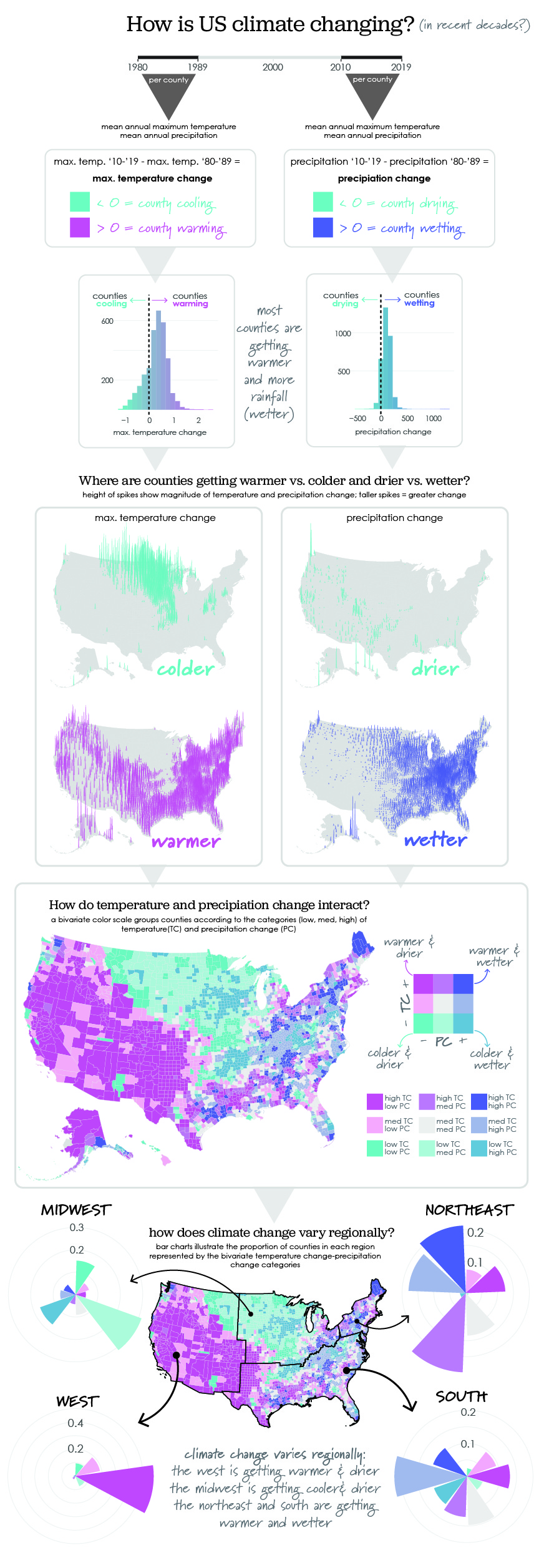
This graphic was inspired by a lovely post showing recent rises in climate change-induced drought by region. I downloaded daily maximum temperature and precipitation data from the daymet dataset on google earth engine and calculated the average maximum temperature and the annual summed precipitation by year per US county. I averaged these values by 2 decades: 1980-1989 and 2010-2019. I compared these decadal averages to examine spatial patterns in where counties are warming vs. cooling or dying vs. wetting, on average. I was also stoked for an excuse to try out spike maps using a recently developed R package - thanks to the dev for this!
You can download this visualization here: Download here.