visualizing hierarchies in R
Here are a couple ways of exploring hierarchical (nested) data in R. This dataset consisted of taxonomic (order, family, genus, species) data for dragonflies and damselflies. I wanted to visualize the representation of species in the dataset across biological levels.
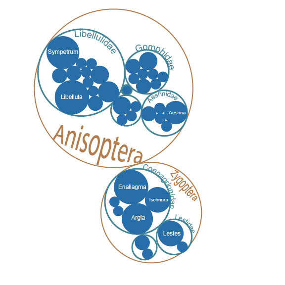
^ This first approach used a circle pack diagram. The circle size represents the number of species per level, with the finest resolution being genera (filled blue cirles). This was realitively easy to code with the igraph package. But I wanted to also show species attributes on the graph (e.g., relative differences in body size among species).
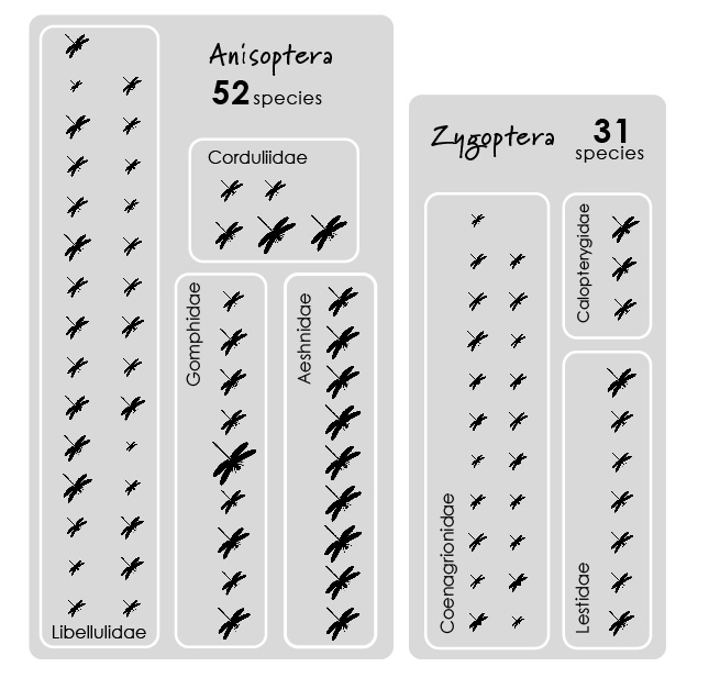
^ To do this, I wanted to use a pictogram chart.
This was a bit harder to do in R. The waffle package does this well. But I wanted to customize species positions. So I determined ‘coordinates’ (x & y locations) of orders/families/species based on an imaginary grid (here the grid was 7 x 15) and used the ggimage package to display icons for each species.