• Skip to primary navigation
  • Skip to content
  • Skip to footer
taylorWoods
  • research
  • dataViz
  • vitae
  • about
    taylor woods

    taylor woods

    postdoc @ USGS

    • EESC @ Leetown
    • GitHub
    • Email
    • Google Scholar

    bivariate maps

    less than 1 minute read

    beers 
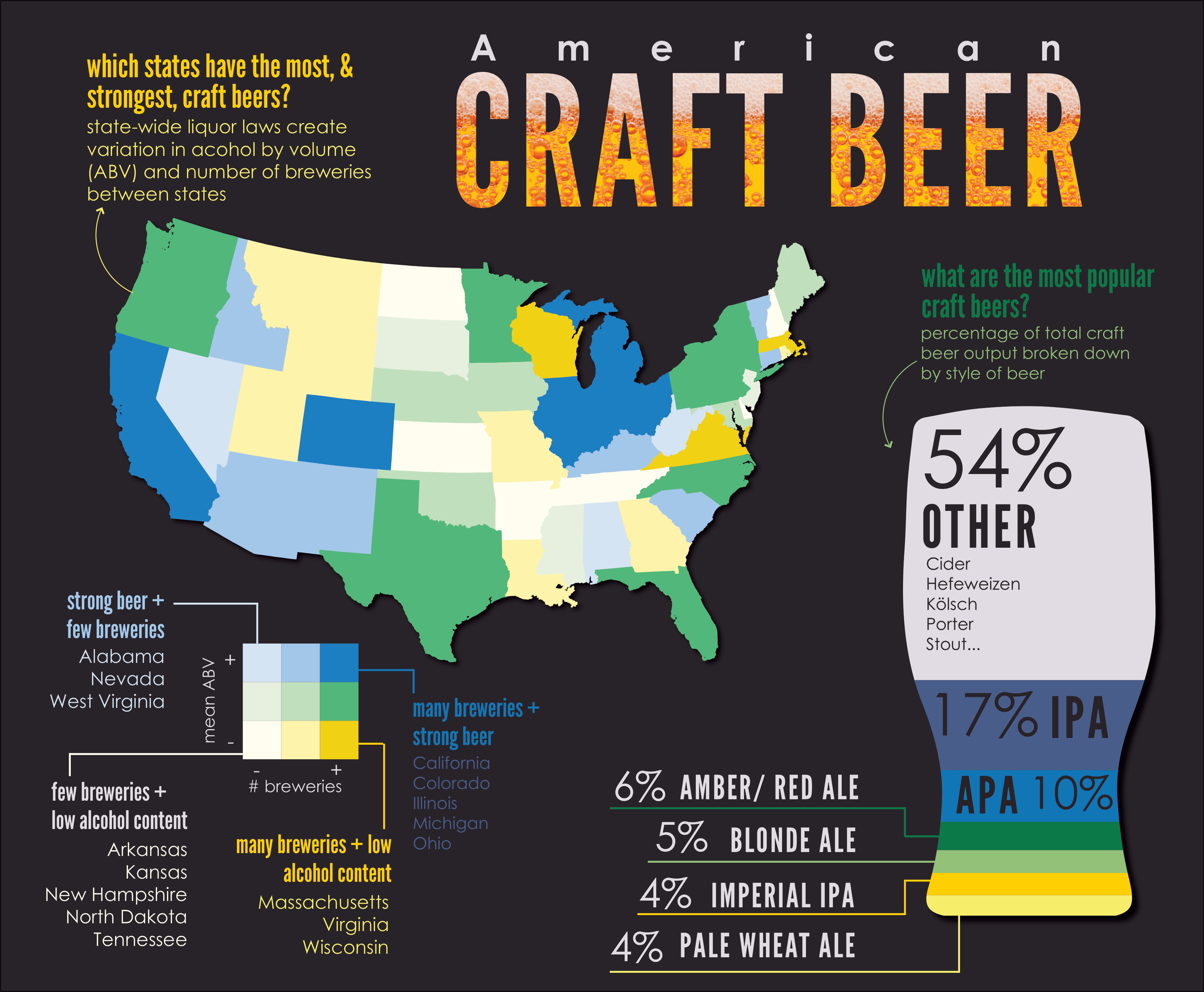
This map applies a bivariate color scheme to display the number of breweries and average beer ABV across states. The color palette was implemented with the pals R package. Since making this graphic, I’ve also used this elegant guide by Timo Grossenbacker to make maps with more customized bivariate color palettes. Download here.

    Tags: food, infographics

    Categories: Blog

    Updated: April 2, 2021

    Twitter Facebook LinkedIn
    Previous Next

    You May Also Enjoy

    visualizing hierarchies in R

    less than 1 minute read

    Here are a couple ways of exploring hierarchical (nested) data in R. This dataset consisted of taxonomic (order, family, genus, species) data for dragonflies...

    recent climate change

    less than 1 minute read

    This graphic was inspired by a lovely post showing recent rises in climate change-induced drought by region. I downloaded daily maximum temperature and p...

    network analysis: MLB

    less than 1 minute read

    Here, I explore basic components of social networks using Sean Lahman’s MLB dataset. The infographic displays centrality of teams based on relationships ...

    US population maps

    less than 1 minute read

    I visualized county percentages of state populations using data from the R package tidycensus. Mapping the percentages nation-wide revealed states with l...

    • Feed
    © 2022 taylorWoods. Powered by Jekyll & Minimal Mistakes.