• Skip to primary navigation
  • Skip to content
  • Skip to footer
taylorWoods
  • research
  • dataViz
  • vitae
  • about
    taylor woods

    taylor woods

    postdoc @ USGS

    • EESC @ Leetown
    • GitHub
    • Email
    • Google Scholar

    donut charts

    less than 1 minute read

    sp_varimp 
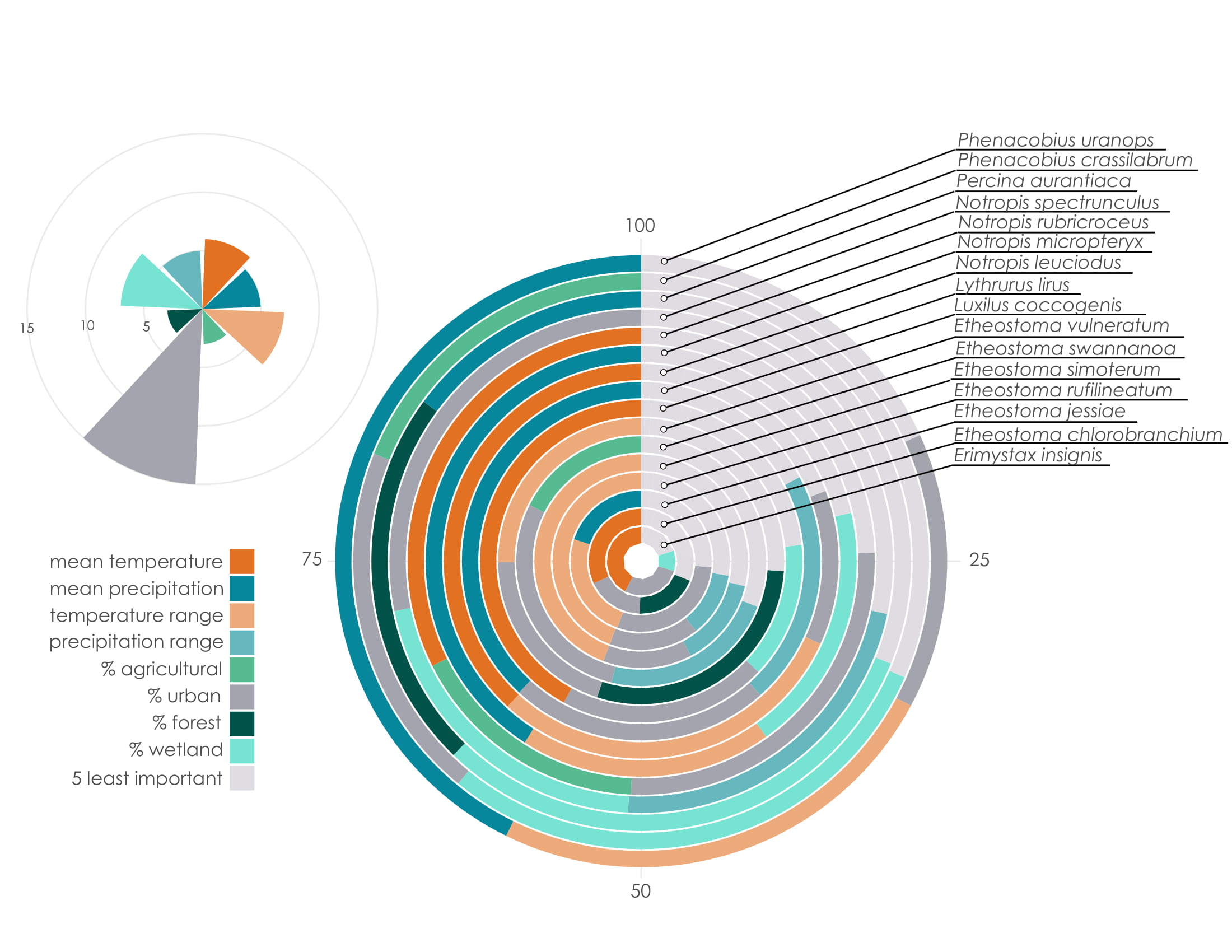
The infographic above uses nested donut charts to show the variable importances for species from species distribution modelling. Here is a good introduction to donut charts in ggplot2.The bar chart in the upper left corner indicates how many times a variable was included in the best-performing model, among all species. Download here.

    Tags: infographics, science

    Categories: Blog

    Updated: April 2, 2021

    Twitter Facebook LinkedIn
    Previous Next

    You May Also Enjoy

    visualizing hierarchies in R

    less than 1 minute read

    Here are a couple ways of exploring hierarchical (nested) data in R. This dataset consisted of taxonomic (order, family, genus, species) data for dragonflies...

    recent climate change

    less than 1 minute read

    This graphic was inspired by a lovely post showing recent rises in climate change-induced drought by region. I downloaded daily maximum temperature and p...

    network analysis: MLB

    less than 1 minute read

    Here, I explore basic components of social networks using Sean Lahman’s MLB dataset. The infographic displays centrality of teams based on relationships ...

    US population maps

    less than 1 minute read

    I visualized county percentages of state populations using data from the R package tidycensus. Mapping the percentages nation-wide revealed states with l...

    • Feed
    © 2022 taylorWoods. Powered by Jekyll & Minimal Mistakes.