• Skip to primary navigation
  • Skip to content
  • Skip to footer
taylorWoods
  • research
  • dataViz
  • vitae
  • about
    taylor woods

    taylor woods

    postdoc @ USGS

    • EESC @ Leetown
    • GitHub
    • Email
    • Google Scholar

    US population maps

    less than 1 minute read

    population

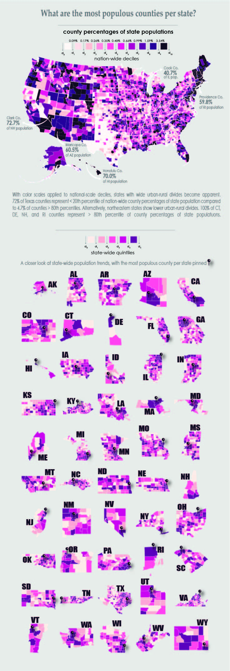
    I visualized county percentages of state populations using data from the R package tidycensus. Mapping the percentages nation-wide revealed states with large vs. small urban-rural divides. This infographic made use of small multiples to map state-wide population patterns using the package tmap. Download here.

    Tags: infographics, misc

    Categories: Blog

    Updated: August 13, 2021

    Twitter Facebook LinkedIn
    Previous Next

    You May Also Enjoy

    visualizing hierarchies in R

    less than 1 minute read

    Here are a couple ways of exploring hierarchical (nested) data in R. This dataset consisted of taxonomic (order, family, genus, species) data for dragonflies...

    recent climate change

    less than 1 minute read

    This graphic was inspired by a lovely post showing recent rises in climate change-induced drought by region. I downloaded daily maximum temperature and p...

    network analysis: MLB

    less than 1 minute read

    Here, I explore basic components of social networks using Sean Lahman’s MLB dataset. The infographic displays centrality of teams based on relationships ...

    2021 march madness

    less than 1 minute read

    While watching March Madness this year, I felt there seemed to be a ton of upsets. So I used a 1985-2016 NCAA March Madness dataset and filled in data from ...

    • Feed
    © 2022 taylorWoods. Powered by Jekyll & Minimal Mistakes.